by Dr. Mick Kerrigan – RecommenderX CTO.
A picture tells a thousand words. Gaining insight into data signals is easier when the information is presented visually; however, data visualization is about more than just line, bar, and pie charts.
Today we are announcing the addition of a number of new Rich Data Visualizations to the Advise platform that are helping us to present Consumer Packaged Goods (CPG) data to our customers in new and innovative ways. Ultimately these visualizations make it easier than ever to find the insights you are looking for and to make the right data-driven decisions about your products.
Map Charts
As our team has been exploring store-level data (more on that in an upcoming blog post) it has become obvious that we need to be able to make it easy for field sales teams in a CPG business to understand store performance in different suburbs, cities, counties, and regions. What better way to visualize this data than through rich maps that can help you to spot geographical patterns quickly.
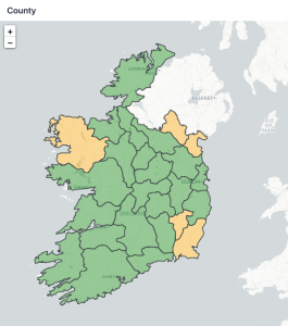
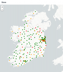
Our new map charts are powered by LeafletJS.com and give us the flexibility to apply different map styles, and overlay points, and polygons that represent stores, counties, and regions.
Calendar Charts
Being able to analyze the price positions of your products and the promotions you are running is key to ensure that you optimize your revenue and margin. As we delve deeper into pricing and promotion analysis we have observed that it is difficult for category managers to get a holistic picture of a product’s promotion calendar. This is critical both for understanding your own products’ promotion calendars but also those of your competitors so that counter promotion activities can be effective.
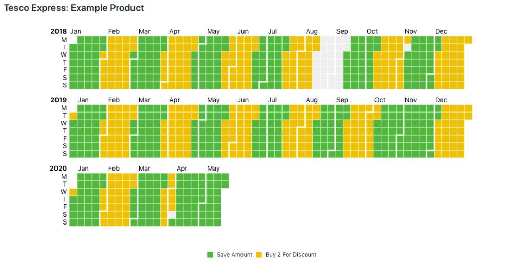
We have therefore added calendar charts to Advise, which enable to us to quickly visualize the promotion strategy for a particular product in a particular retailer. These interactive calendar charts also enable you to drill into particular promotions to identify their performance.
Sankey Charts
As businesses become more data-driven, it becomes important to understand how different members of the team of using the Advise for CPG platform. How are they navigating between the different dashboards? what filters are they using? do they require further training? and how can we help them to be more effective?
The Advise Usage module helps to answers those questions. We have added Sankey charts to the Advise platform to support such they visualization of flow between dashboards, which is key to understanding user interactions.
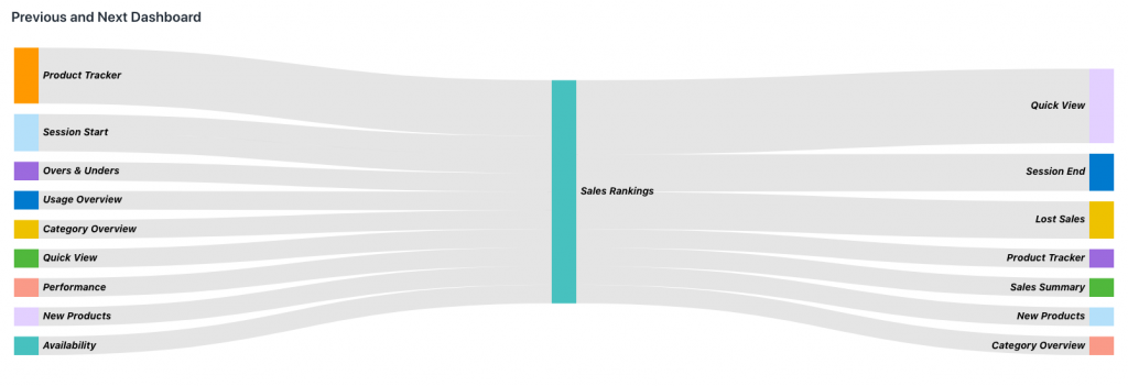
Above and beyond our Sankey charts we also support circular links in Sankey charts to represent even more complex flows.
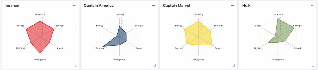
Radar Charts
Comparing different time periods, products, or stores visually is always a challenge with traditional chart types. Radar charts are a useful mechanism for gaining a holistic assessment of multivariant data. Two radar charts side by side can be used to present the comparative relationship between the different items visualized. We are delighted to be able to offer these in Advise going forward.